

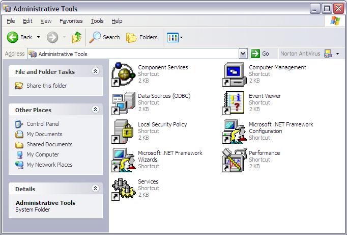
I really don't get this. Microsoft invests millions of dollars in their brand every year - their look and feel. So why is it that they have never, ever completely finished the UI of an OS before they released it? I'm a Windows Lifer in all likelihood (but who knows, I also quite smoking this year), so this isn't an anti-MS rant - I'm just trying to figure out who was asleep at the switch. There is no reason for something this developed, this planned - this invested, to look like such absolute crap.
These icons should have been buried with Windows 3.1, but here they are pointing the way. I also love how they use the same icon to mean two different things on the same page (and if you look real closely, you'll notice that even these two icons are actually different - one is smoothed and the other isn't.)
Is this indicative of the quality under the hood of the OS?

